Skip to content
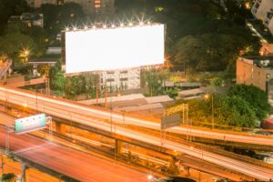
There are so many considerations when it comes to creating your billboard. First, you have to decide what kind of billboard you want. Your static options are often cheaper. But, once erected, these vinyl centered selections cannot be changed. Hence why they’re called static. To address this, try going digital.
Digital options can run a tad more expensive, but the convenience makes them well worth it. You’re allowed to change them whenever you want. You may have to share these with other advertisers, but that has little effect on impressions. So let’s say you’ve decided which you want go with. The next great question is, what colors should go into your design.
Choosing the colors that fit you
As Bill explains above, contrast is key on a billboard. It’s fairly easy to understand why this would be the case. If you use too many dark colors, it’s going to be very difficult for people to make out the copy.
The colors you use can also suggest the quality of your board. “For example, [think of a] black background with yellow copy.” This does in fact count as contrast. But, this also would not be considered as sophisticated.
Instead, try “a red background with white copy… [or] a white background with red, white, and blue copy. [Even] dark green and white” are a solid choice. Each of these showcase considerable contrast and will stand out considerably.
Choosing Effortless Outdoor Media
Effortless Outdoor Media is a leader in out of home advertising. Our experience includes three decades of providing best in class billboards to clients. We can connect with any advertiser in the United States. Whatever your outdoor media needs are, we can accommodate.
If you’re ready to take the next step, head on over to our contact page. Our response rate is impeccable. We’ll have you set up and ready to go in no time!
Clip Transcript:
Jason Sirotin:
Hi, I’m Jason Sirotin, And today I’m speaking with Bill Hobbs, who is the owner and proprietor, managing director, everything, of Effortless Outdoor Media, which is an outdoor media advertising placement company. What colors work best on billboards?
Bill Hobbs:
That’s a great question. So the colors that work well are something that has a ton of contrast. So for example, you don’t want to have a black background with dark green copy. That’s not going to show up, but if you use anything with, for example, black background with yellow copy is the highest vibrant colors that will get your attention. However, that’s not really a high end… If you’re trying to sell diamonds or anything, it’s more like a lower class… Something for like cash for gold.
Jason Sirotin:
Cash for gold.
Bill Hobbs:
Yeah. We buy gold, that kind of thing. But anything like a red background with white copy or a white background with red copy and blue and white, dark green and white, anything that has a ton of contrast. Like the Wendy’s logo is a red background with white copy, stuff like that, and anything with a ton of contrast are the best color. So there’s a number of different colors you can use, but you want to have as much contrast as possible between the background and the type that you use.
Jason Sirotin:
Bill. Thank you so much for sharing your knowledge with us today. We really appreciate it. If you’re interested in learning more about what Bill has to offer, you can visit him online at effortlessoutdoormedia.com and you can email him at bhops. That’s B-H-O-B-B-S, @effortlessoutdoormedia.com.